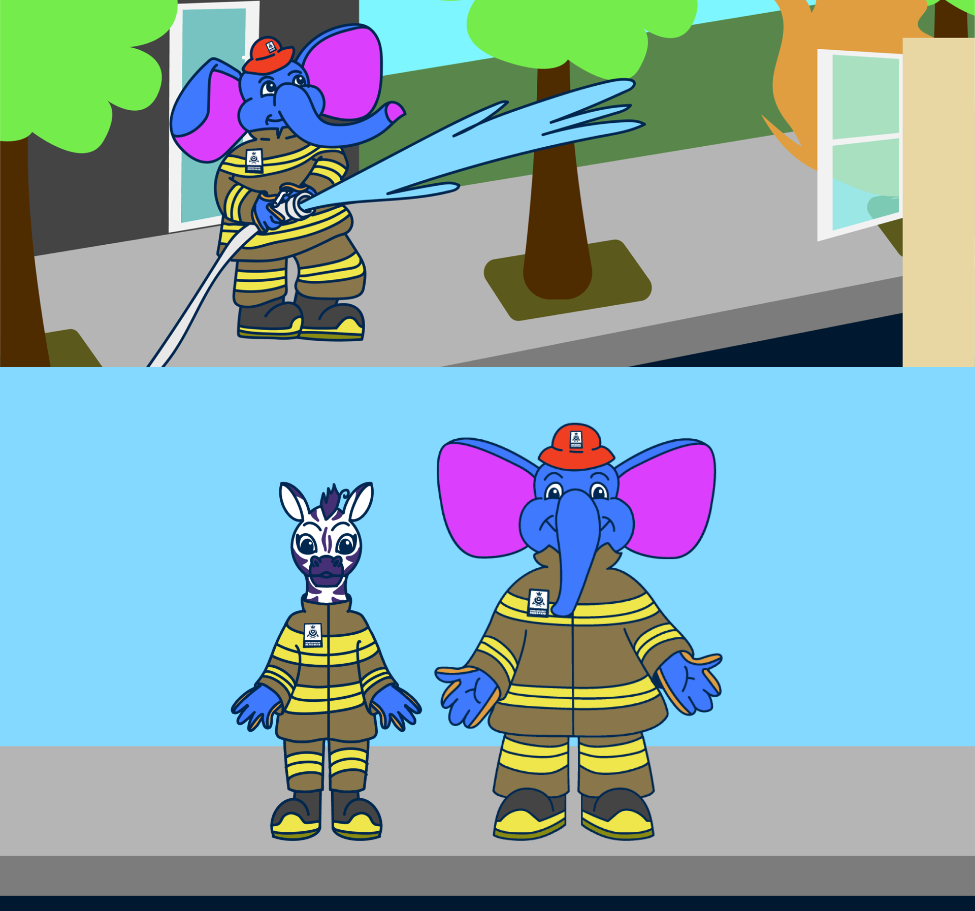
BørneMaskot Redesign: Ildfanten – Hovedstadens Beredskab
Children Mascot Redesign: ILDFANTEN – the Greater Copenhagen Fire Department
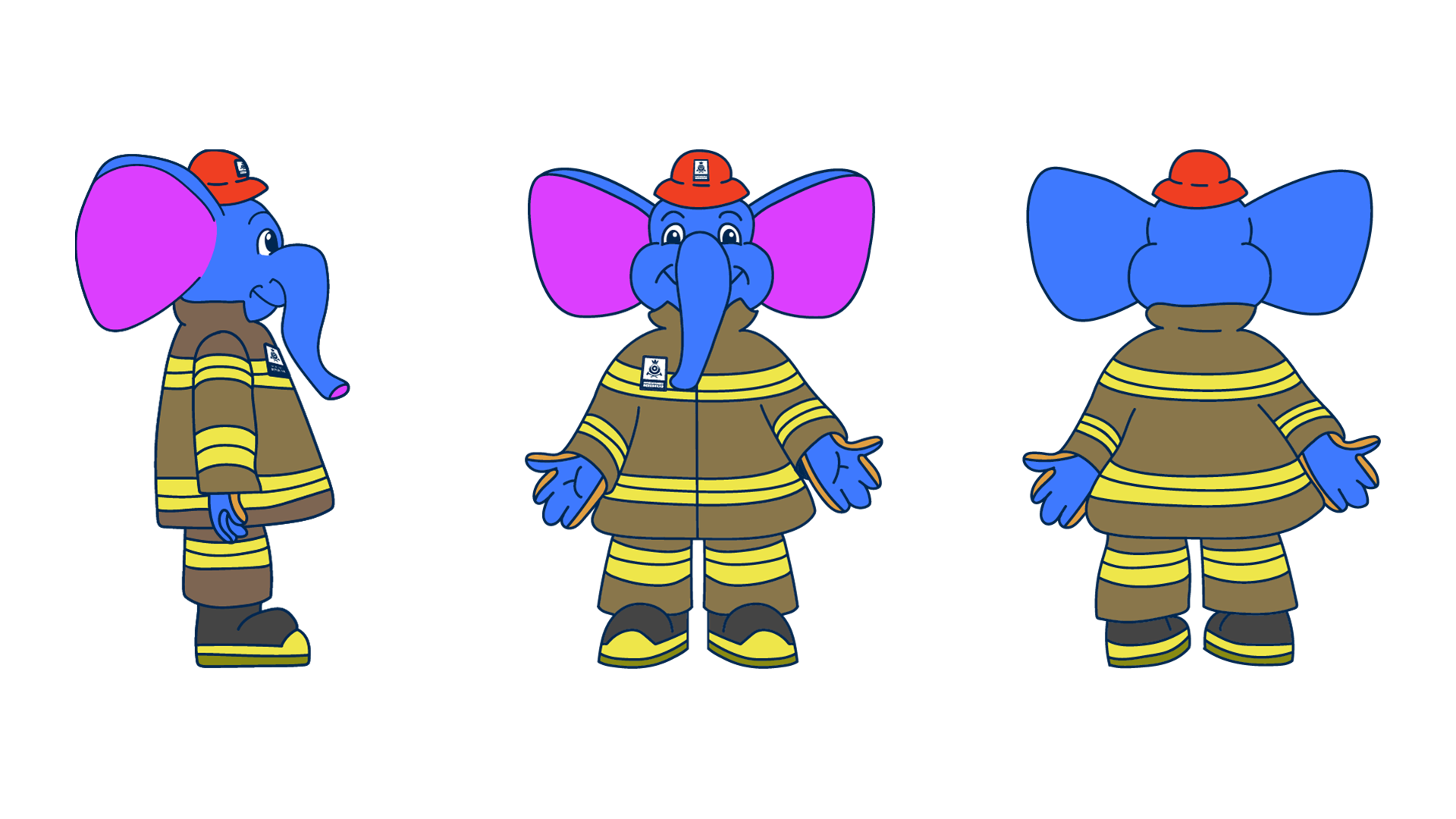
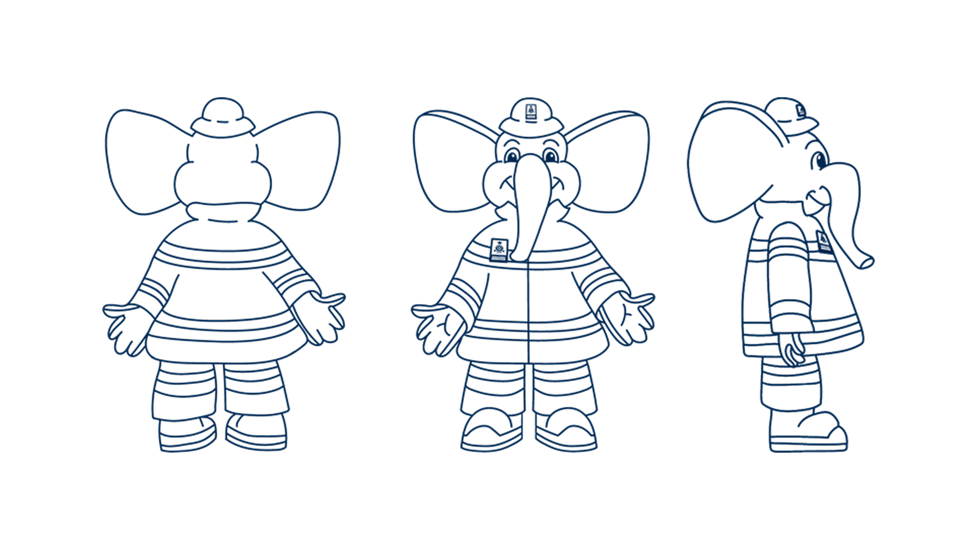
I was tasked with redesigning the children’s mascot Ildfanten, as he had not been consistently maintained for years and needed to be updated to align with the current visual guidelines.
Challenges with Ildfanten
Visual inconsistency
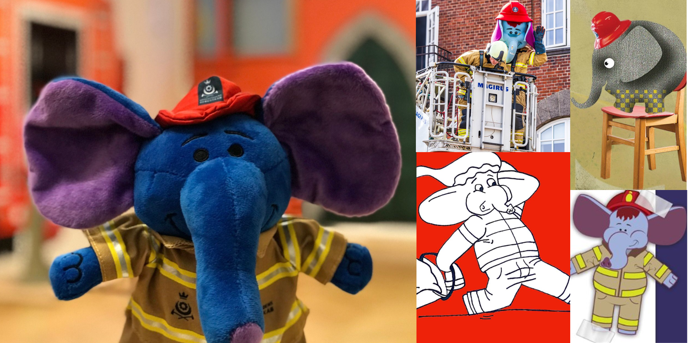
The original Ildfanten lacked a cohesive visual language. He was illustrated in different ways, resulting in a fragmented and inconsistent graphic expression.
Lack of brand alignment
He had no connection to the visual identity and branding of Copenhagen Emergency Services. This created confusion, as he did not match the surrounding materials.
Unclear narrative
Ildfanten’s role is not clearly defined. When appearing as a mascot, he is sometimes portrayed as being in trouble, rather than as the heroic figure he is intended to be.
Need for recognizability
To function effectively as a brand asset, he needs to be easily recognizable—especially for children. For future partnerships that may use him, strong recognizability is essential. As a mascot, he should be identifiable at first glance and maintain a consistent character design.
Introducing Jazz the Zebra
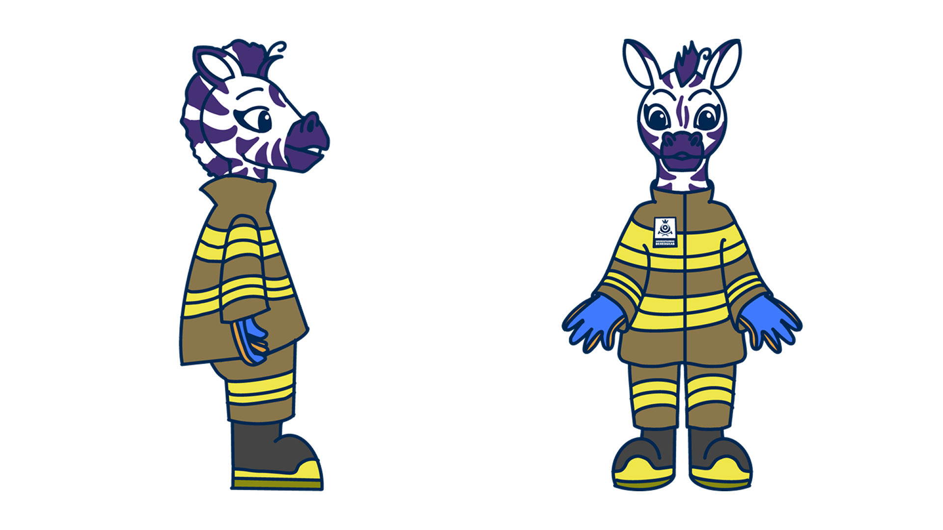
The lack of a defined role for Ildfanten created space to explore a complementary character. I developed Jazz the Zebra as a more quick-thinking and impulsive figure, contrasting Ildfanten’s steadier nature. Their dynamic allows them to support each other through their different strengths.
Visual Examples